Designing purpose: Jackie Bos of Bos Wine on the art of the wine label
When perusing your local wine shop or grocery store wine aisle, how do you choose which bottle to take a chance on for the evening?
Of course, it helps to know what food, if any, you’ll be pairing said bottle with. And perhaps you’ve even narrowed it down to a singular style, varietal, and/or region.
In a perfect world, a knowledgeable but unpretentious and exceedingly patient shopkeeper or associate would ask you some probing questions and then steer you to a few options.
But what if they’re busy being exceedingly patient with the customer ahead of you and you’re expecting company at your house across town in 20 minutes?
If you belong to the largest generation of wine drinkers — that is, if you’re a Millenial — you’re more than likely going to choose a wine based on its boldly colored, non-traditionally labeled bottle that stands out from the crowd in your target price range. Studies have proven this proclivity particularly among this generation, but others aren’t immune from the spellbinding power of the creative wine label.
“I think a lot of consumers are taking a lot of factors into consideration when they’re buying a bottle of wine,” says Jackie Bos of northern Michigan’s Bos Wine. “But a lot of people also like picking up a pretty bottle they can give as a hostess gift and have on the table for a holiday dinner. For me, a pretty package is a really important part of the whole thing. You’re sitting and talking and eating and checking out the label and it’s just part of the whole experience.”
A landscape architect by training with a graphic design concentration, Bos has been crafting labels for Bos Wine bottles since 2010, when she and her husband Dave Bos launched their label in California with 48 cases of Phoenix Ranch Syrah.
“The wine is really Dave’s artwork,” Jackie says of her husband, who identifies himself first as a biodynamic farmer and a winemaker second. “He’s farming and making the wine. My contribution is the packaging of that art.”
The California girl and Michigan boy met in Napa, where Dave served as vineyard manager for Grgich Hills Estate after getting into Michigan wine early in his career. But in 2017, the couple returned to the Mitten to plant roots for their growing family in the Traverse City region’s burgeoning wine scene.
Despite the big change, the Bos logo remains the same since that first bottling.
“The way I think of logos is similar to landscape architecture,” Jackie Bos says. “You’re trying to take all the things you want and the needs of the customer but minimize it so it’s as simple as possible.”
The couple were married in 2008, so the logo features a pair of what looks to be uncompleted figure 8s, each hinting at the curves in every letter of the Bos name.
“In the background of my thinking, I’m always looking at wine labels that pop out to me and asking myself why they pop out and how we can do that with our labels,” Jackis says. “ From what I’ve seen on shelves, the ones that are simple and bold are what pop to me. So with our traditional Bos logo, I’ve kept it really clean and simple, even though the logo is very specific. I always do a bold saturated color based on a garden color, as a nod to our Bos Wine Garden.”
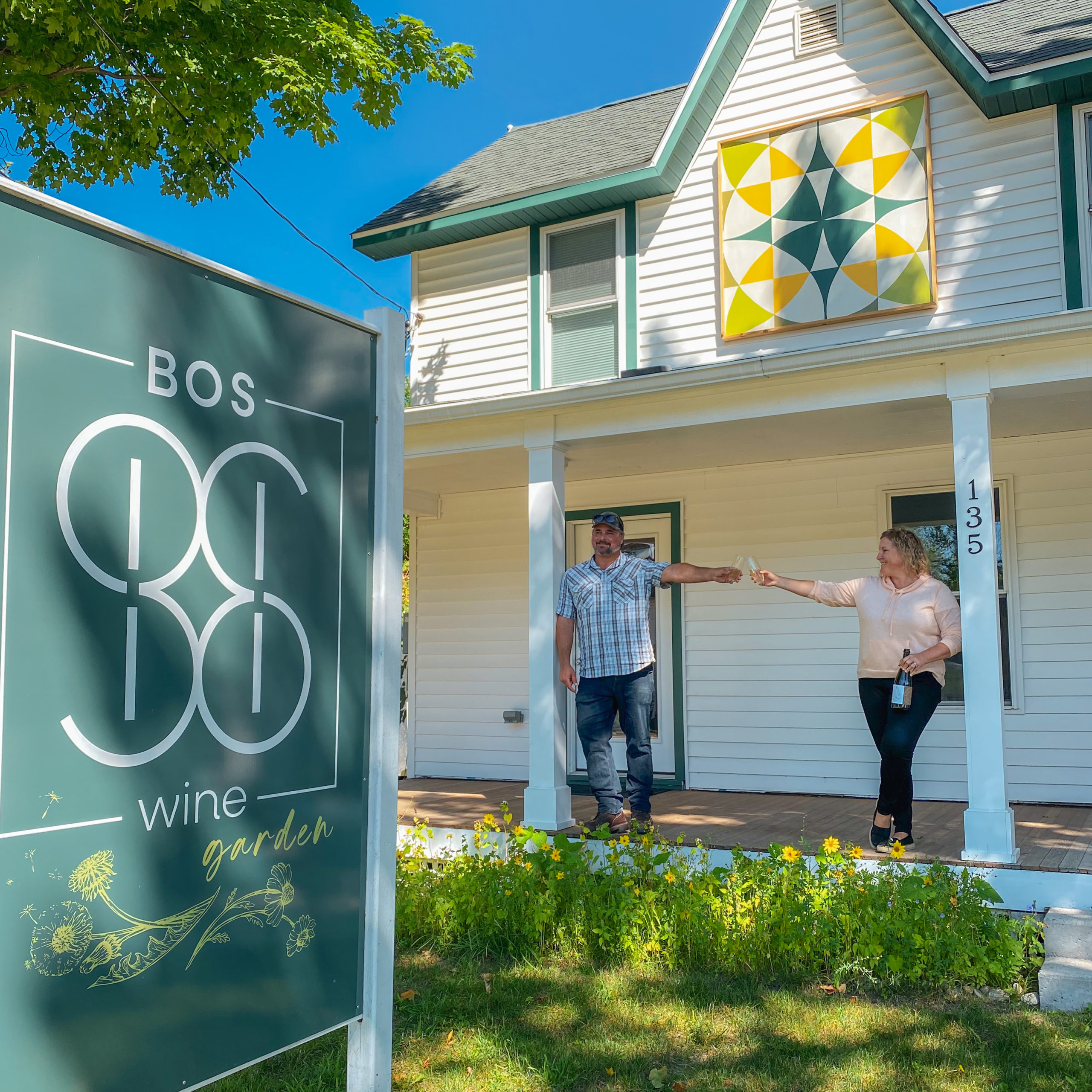
Though the couple had hoped to open a tasting room out of a barn on their acreage in Williamsburg, a small municipality just outside of Traverse City, the COVID-19 pandemic drove construction costs up too high to make it feasible. The Boses pivoted and instead set up shop in a century-old farmhouse 20 minutes north in Elk Rapids, debuting their Bos Wine Garden there in September 2021.
“We moved to Michigan and Dave was telling me about wanting to do smaller batches of wine to practice hybrid grapes or different wine styles he hadn’t done before or are relatively new to the area,” Jackie recalls. “We’re talking about this and we’re driving through the area and my landscape architecture brain is just picking up what’s out in the landscape and noticing the quilt squares on all of the barns in this area. In doing that, my brain goes, ‘How can this work into our brand and packaging?’”
Circles have been a design throughline in all of Bos’ labels, so Jackie set out to incorporate the quilt squares into both the physical space and a wine label that still felt true to the brand.
First, she found a quilt square design based on a circle, then pulled the template into Adobe Illustrator and started working with layers. She then printed those layers out to add additional flourishes by hand with colored pencil, and then brought it back into Illustrator for final touches.
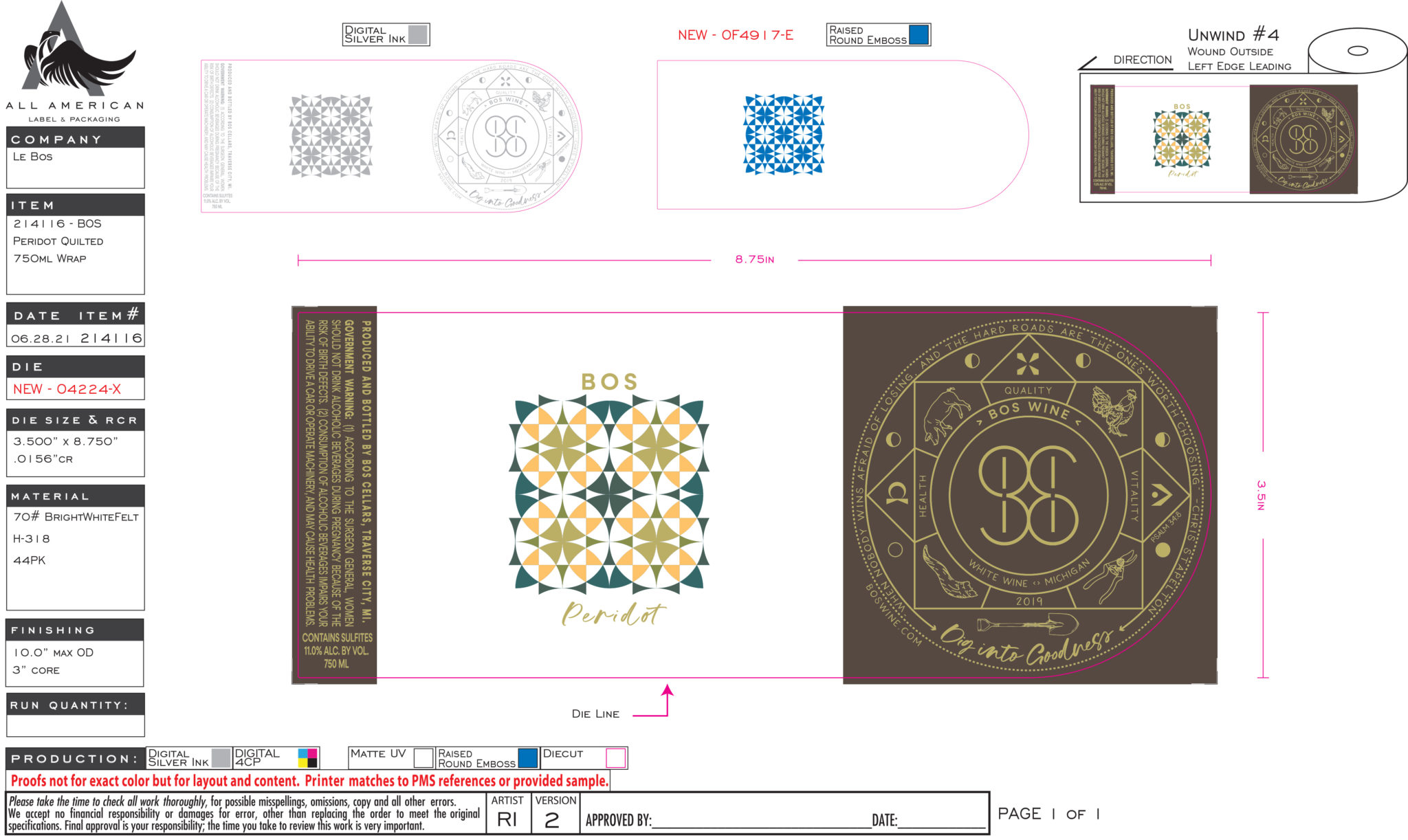
The design now graces the label for Bos’ Peridot, made from the Valvin Muscat hybrid grape. It also welcomes guests to the Bos Wine Garden, where local artist Heather Spooner fabricated a large-scale version to hang above the entrance to the brick-and-mortar.
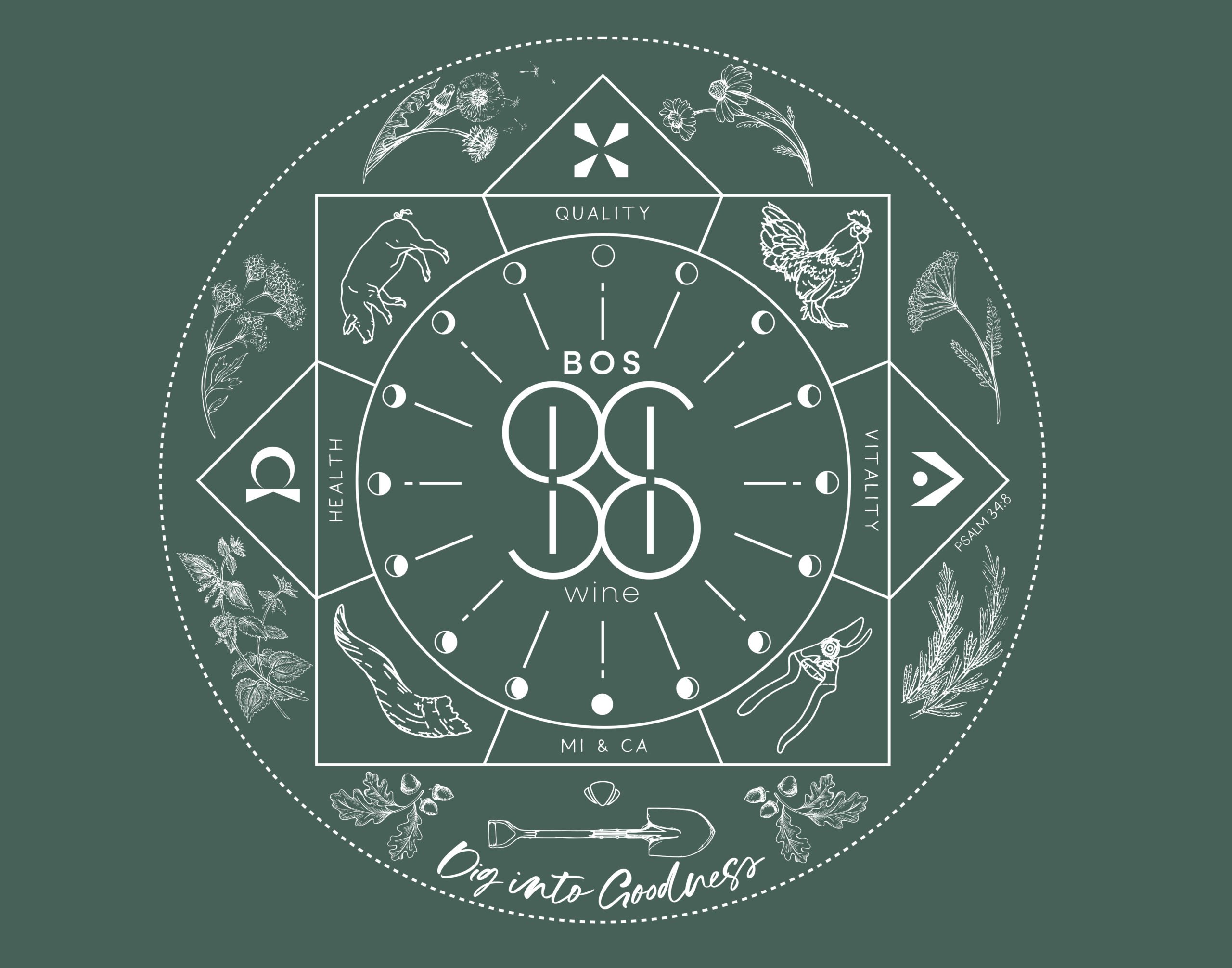
Circles also show up in a big way on the back of most Bos Wine labels. In a spot typically reserved for informational text, Bos created a simplified alchemy wheel that tells a deeper story about the brand in a visually appealing way.
“I had been working on being able to talk about organic biodynamic farming without saying organic biodynamic,” Jackie explains. “And the best way that I could think to do this was in an alchemy wheel to include a lot of the parts Dave talks about when he’s talking about his farming practices.”
Dave Bos bases his farming practices on the lunar calendar, so the alchemy wheel incorporates the moon phases. It also features farm-friendly illustrations from artist Amelia Svec, including a line-drawn pig and chicken crowned with wildflowers. There’s the oft-misunderstood biodynamic horn, used to create a supercharged type of manure, as well as callouts to both Michigan and California, where the Boses hail from and still source their grapes.
“It’s technically the back of the bottle but a lot of the people really like to look at that part,” Jackie says, adding that some shopkeepers display both the front and the back of the bottle, effectively doubling Bos’ real estate on the shelf.
“It’s just been really fun to have the labels be a part of our journey and story and Dave’s farming practices and have a purpose for why they are designed the way they are,” Jackie says. “When we started off with the wine label, I was asking, ‘Why are we doing it this way? How are we different?’ And it really forces you in an artsy way to think through some of your storytelling, which is ultimately really helpful in the delivery of everything else.”
— By Mark Kurlyandchik
Related Stories


